
Tennis-inspired interiors are taking center stage, with sports wall art becoming a favorite among design enthusiasts. If you are looking to create a statement piece, a tennis court poster offers both style and a nod to athletic passion.
This guide will show you how to design a standout tennis court poster for 2025. Discover the latest trends, professional design tips, and inspiration to elevate any space.
Explore the essentials of poster design, trending aesthetics, color palettes, sustainability, and practical advice. Unleash your creativity and bring a dynamic touch to your walls with actionable insights from this comprehensive resource.
The Rise of Tennis Court Posters in Modern Decor
Tennis court poster designs are transforming modern interiors, bridging the worlds of sport and style. As more people seek unique wall art for their homes or offices, these posters are capturing attention through their bold visuals and nostalgic themes.
Growing Popularity of Sports-Inspired Wall Art
The demand for sports-themed wall art has surged in recent years, with tennis court poster designs leading the trend. Homeowners, designers, and businesses are embracing the athletic energy and visual impact these pieces bring. According to Sports-Inspired Home Decor Trends, sports motifs are now featured in everything from living rooms to boutique hotels, often highlighted in prominent design magazines.
Major tennis tournaments like Wimbledon and the US Open have influenced this movement, inspiring posters that celebrate both the sport's heritage and its contemporary flair. Tennis court poster collections are frequently showcased by influencers who value their blend of nostalgia and modern minimalism. These posters are not just decorative; they symbolize the passion and dynamic spirit of tennis, making them a statement choice for any space.
Why Tennis Courts? The Visual and Emotional Appeal
A tennis court poster stands out for its clean lines, geometric symmetry, and vibrant color palette. The visual clarity of court markings translates beautifully into graphic art, offering a sense of order and energy. These design elements evoke memories of iconic matches and friendly games, connecting viewers to moments of play and competition.
The versatility of tennis court poster art means it can suit a variety of decor styles. Whether your aesthetic is minimalist, retro, or cutting-edge contemporary, these posters adapt effortlessly. For tennis fans and athletes, the emotional resonance is even stronger, as each poster becomes a reminder of personal milestones or legendary tournaments.
Key Audiences and Use Cases
A tennis court poster appeals to a wide range of individuals and settings. Home decorators looking for a distinctive statement piece often choose these posters to anchor gallery walls or add color to neutral rooms. Sports enthusiasts and collectors appreciate the artistic representation of their favorite courts, while hospitality venues such as gyms, clubs, and cafes use tennis court poster art to create thematic environments.
Additionally, these posters make thoughtful gifts for athletes, coaches, and tennis lovers. Their universal appeal ensures they fit seamlessly into both private residences and commercial spaces, providing a fresh take on sports-inspired decor.
Essential Elements of Effective Tennis Court Poster Design
Designing a standout tennis court poster requires a thoughtful approach to composition, color, typography, materials, and scale. Each element plays a key role in transforming a simple print into a compelling piece of wall art. By understanding and applying these fundamentals, you can create posters that capture the spirit of the sport and elevate any space.
Composition and Perspective: What Works Best
The composition of a tennis court poster determines its visual impact. Bird’s-eye views highlight the symmetry and geometry of the court, making spaces feel open and balanced. Courtside perspectives, on the other hand, inject energy and bring viewers closer to the action.
Experiment with cropping and framing to emphasize unique angles or court features. Negative space is a powerful tool, allowing the poster to breathe and drawing attention to key elements. Striking a balance between fine detail and abstraction ensures broad appeal, whether the tennis court poster is for a minimalist home or a lively office.
- Bird’s-eye for structure and calm
- Courtside for dynamism and intimacy
- Use negative space for visual interest
A well-composed tennis court poster draws the eye and complements a variety of interior styles.
Color Theory in Tennis Poster Design
Color is central to the mood and style of any tennis court poster. Classic palettes, such as Wimbledon green or US Open blue, evoke tradition and nostalgia. For 2025, trending hues include pastels, bold contrasts, and earthy neutrals. Using color intentionally can influence emotion and help the poster blend or stand out within a room.
Explore how complementary colors or bold gradients can modernize a traditional design. Test palettes with digital tools to ensure harmony. For more ideas on color selection and current styles, visit Tennis Poster Design Inspiration.
- Classic vs. contemporary color schemes
- Trending colors: sage green, terracotta, electric blue, lavender
- Match poster colors to interior palettes
A thoughtfully chosen color palette can transform a tennis court poster into a true design statement.
Typography and Graphic Elements
Typography adds context and character to a tennis court poster. Whether you include tournament names, dates, or inspirational quotes, the choice of font sets the tone. Serif fonts offer a vintage touch, while sans-serif or custom typefaces create a modern or unique look.
Pay attention to text placement and sizing for both readability and aesthetics. Minimalist labeling can add sophistication without overwhelming the design. Layering text with graphic elements, such as subtle court markings or player silhouettes, enhances visual depth.
- Tournament names or inspirational quotes
- Font pairing for style and clarity
- Graphic accents like lines or icons
Effective typography ensures your tennis court poster communicates its message with clarity and elegance.
Texture, Material, and Print Quality
The tactile quality of a tennis court poster is just as important as its visual aspects. Matte finishes reduce glare and suit modern, understated interiors. Glossy finishes offer vibrancy and can make colors pop, but may reflect light.
Choose paper weight that feels substantial and durable. Eco-friendly options, like FSC-certified or recycled paper, appeal to sustainability-minded buyers. Always use high-resolution images to guarantee sharpness and detail, enhancing the overall impact of the poster.
- Matte vs. glossy: consider lighting and decor
- Heavier paper for a premium feel
- Eco-friendly materials for conscious consumers
Investing in quality materials ensures your tennis court poster stands the test of time.
Size and Scale Considerations
Selecting the right size for a tennis court poster is crucial for its intended space. Standard sizes offer versatility, fitting most frames and gallery walls. Large-scale prints can serve as bold focal points, especially in expansive rooms.
Consider the arrangement: a series of smaller posters creates movement and interest, while a single oversized piece commands attention. Custom sizing allows for a tailored fit in unique or challenging spaces.
- Standard sizes for flexibility
- Gallery walls vs. statement pieces
- Custom dimensions for special projects
Thoughtful sizing ensures your tennis court poster integrates seamlessly into any interior.
Top Tennis Court Poster Design Trends for 2025
Tennis court poster design is entering an exciting era for 2025, with fresh trends that blend style, nostalgia, technology, and sustainability. If you want your space to stand out, keeping up with these movements is essential. Explore the leading directions shaping tennis court poster art this year and discover which trends align with your personal taste or project needs.
Minimalism and Negative Space
Minimalist tennis court poster designs are everywhere in 2025. These posters highlight the clean geometry of court lines, using white space to create a sense of calm and sophistication. The focus is often on symmetry, subtle color accents, and a restrained approach to detail, making them ideal for contemporary interiors.
Examples in top design catalogs show tennis court poster art with a single court outline or a cropped section, paired with gentle pastel backgrounds or monochrome palettes. Minimalism emphasizes clarity and allows the architecture of the sport to shine.
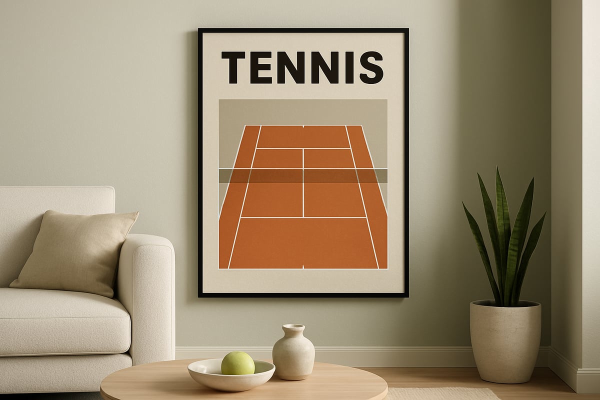
Retro and Vintage Revival
The retro revival trend brings a sense of nostalgia to tennis court poster design. Designers are drawing inspiration from 1970s to 1990s tournament posters, using grainy textures, throwback typography, and faded color schemes. These posters often celebrate iconic moments, legendary players, or classic venues.
Look for tennis court poster prints that showcase muted greens, yellows, and oranges, along with vintage fonts. The appeal lies in both the emotional connection for fans and the visual warmth these posters add to a space.
Abstract and Artistic Interpretations
Abstract tennis court poster art is gaining traction with art lovers and interior designers alike. This trend takes familiar court layouts and reimagines them with watercolor washes, digital paint effects, or geometric deconstruction. The result is a fusion of sport and contemporary art.
Many designers experiment with overlaying tennis motifs on bold backgrounds or blending courts with unexpected textures. Abstract tennis court poster designs offer versatility, fitting seamlessly into modern, eclectic, or even bohemian decor themes.
Sustainability and Eco-Conscious Design
Sustainable tennis court poster production is a top trend for 2025. Eco-friendly materials, such as recycled or FSC-certified paper, are now in high demand. Designers are also choosing water-based, non-toxic inks and minimal, recyclable packaging to reduce environmental impact.
Consumers increasingly prefer posters with a smaller carbon footprint. Many brands communicate their sustainability efforts clearly, making it easier for buyers to align their tennis court poster purchases with eco-friendly values.
Customization and Personalization
Personalized tennis court poster options are growing rapidly. Advances in print technology make it possible to customize posters with specific court names, memorable match dates, or even player statistics. This trend is especially popular among gift buyers and athletes.
Customers can now order a tennis court poster featuring their local club, a favorite tournament, or a cherished moment. The ability to add names or unique details transforms each print into a meaningful, one-of-a-kind statement piece.
Bold Color Blocking and Gradients
Bold color blocking and smooth gradients are defining the tennis court poster landscape this year. Designers are embracing vibrant hues like sage green, terracotta, electric blue, and lavender to create visual impact. These colors reflect broader interior design movements, as seen in Interior Design Trends 2025, and help posters stand out as focal points.
Court layouts are often simplified and paired with dramatic backgrounds, making each tennis court poster a modern artwork in its own right.
Integration with Digital and Augmented Reality
Technology is transforming the tennis court poster genre. Some posters now feature augmented reality elements, allowing viewers to scan a QR code and access match highlights or player bios. This interactive layer bridges the gap between physical art and digital experience.
As AR and digital features become more accessible, expect to see tennis court poster designs that not only decorate a wall but also engage and inform.
Step-by-Step Guide: Designing Your Own Tennis Court Poster
Creating a standout tennis court poster is both an art and a science. Whether your goal is to decorate your home, gift a piece to a tennis enthusiast, or expand your design portfolio, following a systematic approach ensures professional results. Here’s a step-by-step guide to help you craft a tennis court poster that captures attention and elevates any space.
Step 1: Define Your Vision and Purpose
Start by clarifying the reason behind your tennis court poster project. Are you designing for a sports-themed living room, a commercial gym, or as a personalized gift? Understanding your audience shapes every creative decision.
Identify the mood you want to convey. Should your tennis court poster feel energetic and bold, evoke nostalgia, or lean into modern minimalism? A clear vision will guide your choices in imagery, color, and typography.
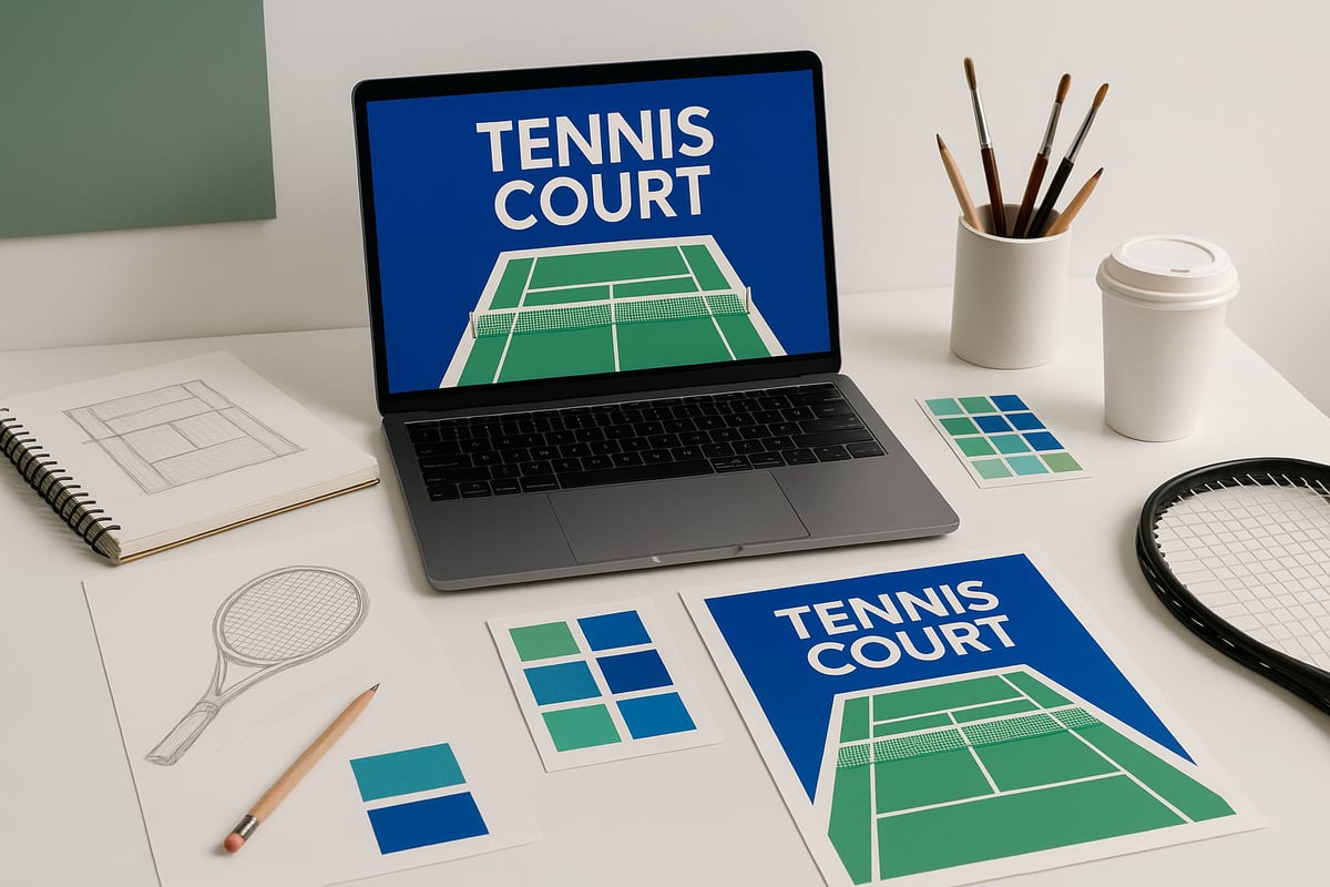
Step 2: Select the Right Court Imagery
Choosing the right imagery is essential for a compelling tennis court poster. Decide if you want to feature a world-famous court, a local favorite, or an abstract interpretation.
Source high-resolution images or commission custom illustrations to ensure your poster looks crisp and professional. For inspiration and curated selections, you can Discover Tennis Posters and Prints to see how different courts and styles are celebrated in wall art.
Opt for original photography or artwork whenever possible, and always verify image rights for commercial projects.
Step 3: Choose Your Color Palette
The color scheme sets the tone for your tennis court poster. For 2025, trending palettes include sage green, terracotta, electric blue, and muted pastels. Think about the environment where the poster will be displayed and select colors that complement the room’s decor.
Test your palette using digital tools to preview combinations and ensure harmony. Classic tennis hues like Wimbledon green or hardcourt blue remain timeless, while bold contrasts or gentle gradients can give your tennis court poster a contemporary edge.
Step 4: Plan the Composition and Layout
Composition is what makes a tennis court poster visually engaging. Experiment with perspectives such as bird’s-eye views or courtside angles to create different moods.
Use cropping and negative space to highlight unique aspects of the court. Try sketching several drafts or using design software templates before finalizing your layout. Balance detail and abstraction to appeal to a wide audience and ensure your tennis court poster stands out.
Step 5: Add Typography and Graphic Elements
Typography can transform a tennis court poster from simple to striking. Decide if you’ll include tournament names, dates, inspirational quotes, or keep text minimal.
Choose fonts that match your intended style: serif fonts for a vintage look, sans-serif for modern simplicity, or custom lettering for uniqueness. Arrange text thoughtfully so it enhances the overall design without overpowering the court imagery. Consistent hierarchy and spacing are key to readability and aesthetics.
Step 6: Select Materials and Print Specifications
Materials greatly affect the look and feel of your tennis court poster. Decide between matte and glossy finishes, considering factors like glare and color vibrancy. Select paper weights that provide durability while maintaining a premium feel.
Consider eco-friendly options such as FSC-certified or recycled paper and water-based inks. Here’s a simple comparison:
| Feature | Matte Finish | Glossy Finish | Eco-Friendly Options |
|---|---|---|---|
| Reflection | Low | High | Varies |
| Color Vibrancy | Subtle | Bold | Depends on ink/paper combo |
| Sustainability | Available | Available | FSC, recycled, non-toxic |
Always ensure your images are high-resolution for sharp, detailed prints.
Step 7: Finalize, Print, and Display
Before printing, review your tennis court poster for any errors or misalignments. Proof every detail, from color accuracy to text placement, to ensure a polished final product.
Choose a frame or mounting option that complements both the poster and the surrounding decor. When hanging, consider lighting and placement to maximize visual impact. For gallery walls, mix your tennis court poster with other sports or travel prints to create a dynamic and cohesive display.
By following these steps, you can confidently create a tennis court poster that not only reflects your vision but also stands out in any space.
Sustainability and Ethical Choices in Tennis Poster Production
Sustainability is transforming the way we approach tennis court poster production. As environmental awareness grows, designers and consumers alike are prioritizing materials, sourcing, and practices that minimize impact on the planet. This shift not only benefits the environment but also aligns with the values of today's design-conscious buyers.
Materials Matter: Eco-Friendly Paper and Inks
The materials used in a tennis court poster play a crucial role in its environmental footprint. Opting for FSC-certified, recycled, or biodegradable papers helps reduce deforestation and waste. Water-based and non-toxic inks further ensure that the finished product is safe for homes and the environment.
A growing number of print studios now offer these eco-friendly options. For a deeper look at sustainable material trends in sports design, consider exploring the Sustainable Sports Facility Design guide. Ultimately, choosing greener materials enhances the appeal and responsibility of every tennis court poster.
Table: Common Sustainable Materials for Posters
| Material Type | Environmental Benefit |
|---|---|
| FSC-certified paper | Supports responsible forestry |
| Recycled paper | Reduces landfill and energy use |
| Biodegradable inks | Minimizes toxic runoff |
Responsible Sourcing and Local Production
Where and how a tennis court poster is produced can make a significant difference in its overall sustainability. Local production shortens the supply chain, reducing transportation emissions and supporting community businesses. Working with nearby printers also allows for greater transparency in sourcing and labor practices.
Responsible sourcing involves selecting partners who prioritize fair labor and eco-friendly methods. By choosing local or regional suppliers, creators ensure their tennis court poster not only looks good but also aligns with ethical standards. This approach fosters trust with consumers who value responsible production.
Packaging and Delivery Best Practices
Packaging and delivery are vital steps in the sustainable lifecycle of a tennis court poster. Minimal, recyclable, or compostable packaging materials help avoid unnecessary waste. For example, using cardboard tubes made from recycled content or biodegradable sleeves can make a big ecological difference.
Best practices include:
- Avoiding plastic wraps
- Using soy-based adhesives
- Printing sustainability credentials on packaging
These details reassure buyers that their tennis court poster purchase supports a greener future. Clear, eco-friendly packaging also enhances the unboxing experience.
Consumer Demand for Sustainable Decor
Eco-conscious consumers are increasingly seeking wall art that reflects their values. Recent studies show that more than 60% of buyers consider sustainability a deciding factor when selecting home decor. The tennis court poster market is no exception, with shoppers looking for transparency in materials and production.
Brands that highlight their sustainable practices stand out and earn customer loyalty. As green awareness grows, offering an ethically produced tennis court poster is not just a trend but a competitive advantage. Meeting this demand ensures continued relevance in the evolving art and design landscape.
Display Ideas: Showcasing Tennis Court Posters in Style
Bringing a tennis court poster into your space is more than just hanging art—it is about making a statement. With the right approach, you can create a focal point that reflects your love for tennis and elevates your decor. Explore a range of creative display ideas to help your tennis court poster stand out in any setting.
Home Decor Inspiration
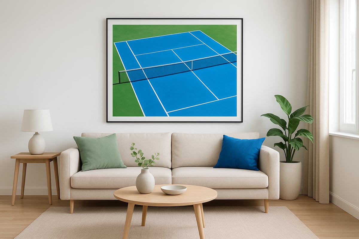
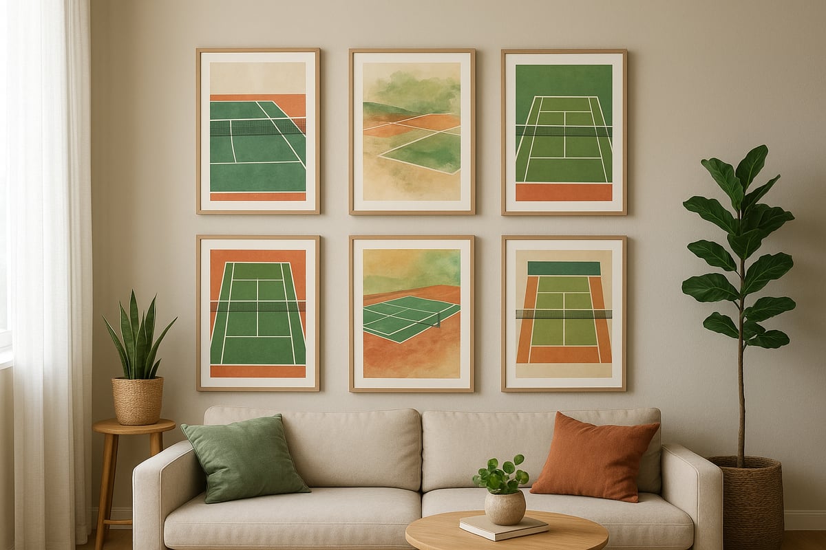
In residential spaces, a tennis court poster can become the highlight of a living room, bedroom, or office. Try placing your poster above a sofa, bed, or workspace for instant visual impact. For those who love curated displays, consider a gallery wall that mixes your tennis court poster with complementary sports or travel prints.
Pairing posters with similar color palettes or frames creates a cohesive look. For more ideas, check out these stylish sports-inspired room designs that showcase how athletic art can transform interiors.
Commercial and Hospitality Settings
A tennis court poster adds energy and sophistication to gyms, clubs, cafes, and hotels. In fitness centers, use posters in entryways or workout studios to inspire guests. Cafes and hotels can leverage tennis imagery to create thematic corners or celebrate local tournaments.
For commercial spaces, choose larger formats or multiple posters for a gallery effect. Hospitality venues often rotate displays to match seasonal events or tournaments, keeping the space fresh and engaging.
Framing and Mounting Options
Selecting the right frame enhances your tennis court poster and protects it for years. Classic frames in black, white, or natural wood suit most designs. Floating mounts offer a contemporary touch, while frameless displays keep the focus solely on the artwork.
Use this quick comparison table for guidance:
| Display Style | Best For | Visual Impact |
|---|---|---|
| Classic Frame | Traditional, Minimalist | Timeless |
| Floating Mount | Modern, Artistic | Sleek |
| Frameless | Contemporary, Gallery | Bold |
Choose a frame material that complements your poster's colors and the room’s decor.
Lighting and Spatial Planning
Proper lighting brings out the vibrancy of your tennis court poster. Use spotlights or picture lights to draw attention to the artwork, especially in dim areas. Natural light works well but avoid direct sunlight to prevent fading.
Arrange multiple posters in a grid or linear layout for maximum effect. Always consider the height and viewing distance for optimal visibility and balance within the room.
Seasonal and Rotational Displays
Keep your space dynamic by rotating tennis court posters based on the season or upcoming events. Swap in posters featuring iconic courts during major tournaments to create excitement. This approach is ideal for both homes and commercial venues.
For more inspiration on selecting the perfect tennis court poster, you can explore this guide to tennis posters featuring iconic courts. Refreshing your display regularly ensures your decor always feels current and personal.