

The resurgence of vintage aesthetics has transformed how we approach interior design, with retro print art emerging as a defining element of contemporary spaces. This nostalgic yet fresh approach combines the bold graphics, vibrant color palettes, and distinctive design languages of the mid-20th century with modern printing techniques and sustainable practices. Whether you're drawn to the atomic-age optimism of the 1950s, the psychedelic experimentation of the 1960s, or the earthy tones of the 1970s, retro print art offers endless possibilities for creating spaces that feel both familiar and excitingly current.
Understanding the Retro Print Art Movement
Retro print art represents more than simple nostalgia. It embodies a deliberate return to design principles that prioritized bold visual communication, optimistic color choices, and graphic simplicity. The modern reinterpretation of retro style demonstrates how contemporary designers blend historical elements with current sensibilities, creating artwork that resonates across generations.
Defining Characteristics of Retro Print Art
The visual language of retro print art draws from several distinctive eras, each contributing unique elements:
- Bold typography with condensed sans-serif fonts and playful script styles
- Limited color palettes featuring saturated hues and unexpected combinations
- Geometric shapes including starbursts, asymmetrical compositions, and atomic-age motifs
- Halftone textures and screen-print effects that add depth and authenticity
- Illustrative approaches ranging from simplified line work to detailed technical drawings
These characteristics create instantly recognizable artwork that adds personality and visual interest to any space. The texture and warmth of 2026 graphic design trends emphasize imperfection and emotional engagement, perfectly complementing the handcrafted aesthetic of retro print art.
Popular Styles Within Retro Print Art
Mid-Century Modern Prints
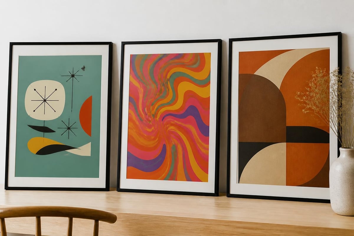
The 1950s and early 1960s produced some of the most enduring design aesthetics. Mid-century modern retro print art emphasizes clean lines, organic forms, and a optimistic worldview reflected through simplified illustrations and bold graphic elements. Travel prints featuring iconic destinations often incorporate this aesthetic, celebrating architectural landmarks and cultural destinations with simplified, geometric interpretations.
Key elements include:
- Simplified architectural renderings
- Atomic-age inspired starburst patterns
- Boomerang and kidney-bean shapes
- Two-tone or three-tone color schemes
- Sans-serif typography with generous spacing
Psychedelic and Pop Art Influences
The late 1960s and early 1970s brought explosive creativity to print design. This era's retro print art features swirling patterns, vibrant color clashes, and experimental compositions that challenge traditional design rules. The retro comic art style exemplifies this period's bold approach, using halftone dots, dynamic compositions, and high-contrast color blocking.
| Style Element | Psychedelic Era | Pop Art Movement |
|---|---|---|
| Color Approach | Clashing neons, gradients | Flat, primary colors |
| Typography | Flowing, organic letterforms | Bold, outlined fonts |
| Composition | Swirling, asymmetrical | Grid-based, repetitive |
| Subject Matter | Abstract, nature-inspired | Consumer culture, celebrities |
| Line Work | Fluid, curving | Sharp, defined edges |
Sports and Recreation Themes
Retro print art celebrating athletic pursuits and recreational activities captures the optimistic leisure culture of post-war decades. Sports prints rendered in vintage styles evoke the golden age of sporting events, from tennis tournaments to golf courses and Formula 1 racing circuits.
These prints often feature:
- Simplified venue illustrations with period-appropriate color palettes
- Vintage typography mimicking event posters from the 1960s and 1970s
- Stylized athletic figures in dynamic poses
- Badge and emblem designs with retro flourishes
- Muted earth tones or saturated primary colors depending on the era referenced
Incorporating Retro Print Art in Contemporary Spaces
Color Palette Coordination
Successfully integrating retro print art requires thoughtful consideration of existing color schemes. The core visual elements of retro graphic design include distinctive color combinations that can either complement or deliberately contrast with modern interiors.
Vintage-inspired color palettes for 2026 include:
- Avocado green, harvest gold, and burnt orange for authentic 1970s warmth
- Turquoise, coral pink, and charcoal gray for mid-century sophistication
- Mustard yellow, teal blue, and chocolate brown for eclectic bohemian spaces
- Cherry red, cream, and black for classic diner aesthetics
The comeback of vintage prints in 2026 demonstrates renewed appreciation for these historically grounded color stories, making retro print art particularly relevant for current design trends.
Strategic Placement and Gallery Walls
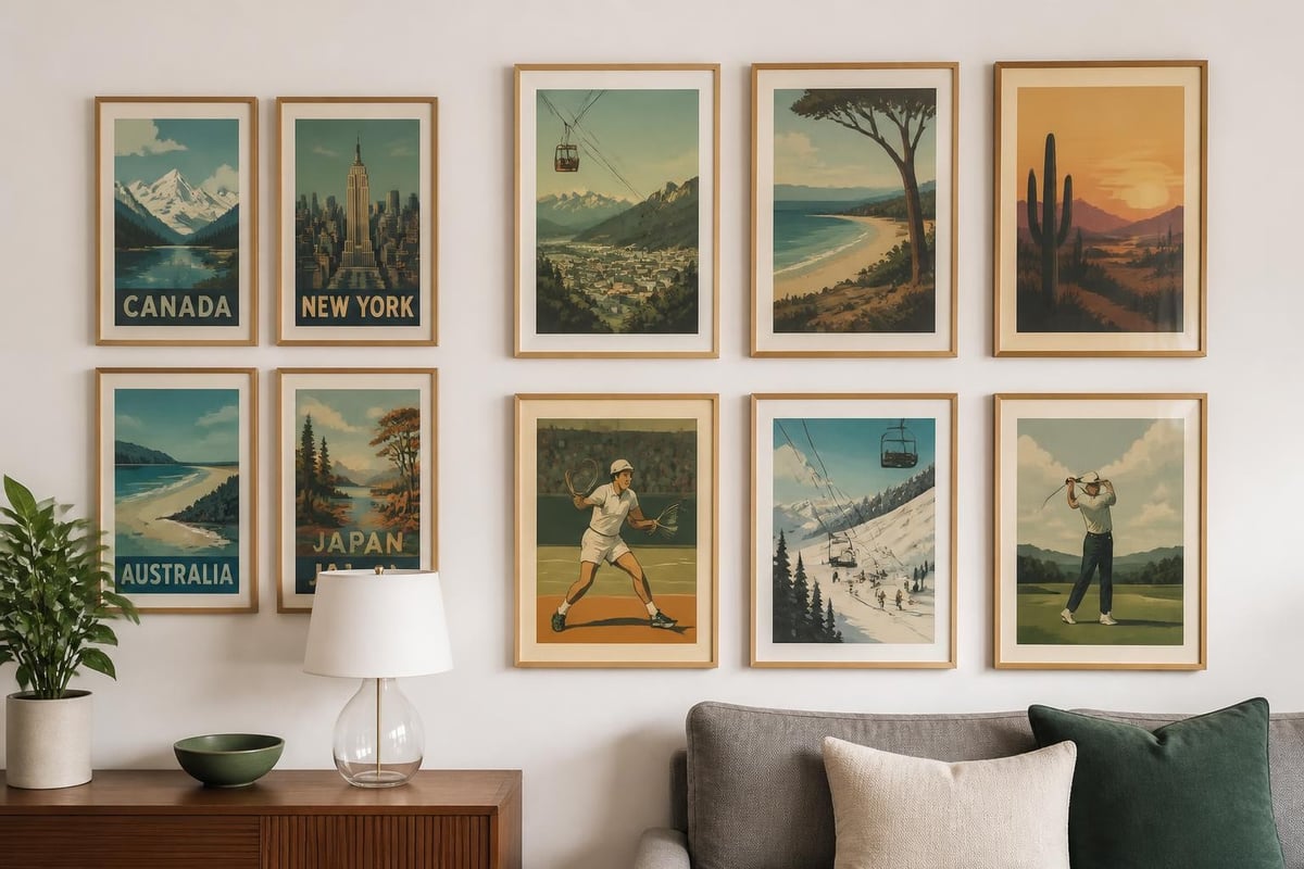
Retro print art makes powerful statements when thoughtfully arranged. Single large-scale pieces anchor minimalist spaces, while curated gallery walls create visual narratives that span decades and styles.
Gallery wall configurations for retro prints:
- Era-focused collection - Group prints from a single decade for cohesive storytelling
- Color-coordinated arrangement - Mix different eras united by shared palette
- Theme-based grouping - Combine travel, sports, or cultural subjects
- Grid layout - Equal-sized frames in precise alignment for modernist effect
- Salon-style clustering - Varied sizes and orientations for eclectic energy
Mixing Retro with Contemporary Elements
The most successful interiors balance nostalgic and modern elements. Retro print art provides historical depth that prevents contemporary spaces from feeling sterile or impersonal. Nostalgic decorating trends making comebacks in 2026 include warm wood tones and textured materials that naturally complement vintage-inspired artwork.
| Contemporary Element | Compatible Retro Print Style | Design Outcome |
|---|---|---|
| Minimalist furniture | Mid-century modern graphics | Harmonious balance |
| Industrial fixtures | 1970s earth-tone landscapes | Textural contrast |
| Scandinavian simplicity | Simplified travel posters | Clean sophistication |
| Bohemian textiles | Psychedelic patterns | Layered eclecticism |
| Modern metallics | Pop art sports prints | Dynamic energy |
Sourcing and Selecting Quality Retro Print Art
Authenticity Versus Reinterpretation
When selecting retro print art, collectors face choices between authentic vintage pieces and contemporary designs inspired by historical styles. Both approaches offer distinct advantages. Original prints carry historical provenance and genuine aging characteristics, while modern interpretations provide superior print quality, archival materials, and designs specifically created for current interior proportions.
Contemporary retro print art often improves upon historical limitations:
- Enhanced color accuracy through modern printing technology
- Archival-quality papers ensuring longevity beyond vintage originals
- Customizable sizing to fit contemporary wall dimensions
- Sustainable production using eco-friendly inks and materials
- Consistent availability without the scarcity of genuine vintage pieces
Theme Selection for Personal Spaces
Choosing retro print art that resonates personally transforms decorative pieces into meaningful focal points. Travel-themed prints celebrate favorite destinations or dream locations, while sports artwork commemorates beloved teams, historic venues, or personal athletic pursuits.
Popular retro print art themes for 2026:
- Vintage airline and railway travel posters
- Historic sporting venues and championship locations
- University and college campus illustrations
- National park and natural landmark renderings
- Cultural event and festival commemorations
The vintage interior trends defining 2026 homes emphasize floral motifs and curvy silhouettes, expanding retro print art beyond traditional geometric designs into organic, nature-inspired compositions.
Design Techniques That Define Retro Print Art
Typography and Lettering Styles
Typography serves as perhaps the most immediately recognizable element of retro print art. Period-appropriate font choices instantly communicate era and aesthetic. The 1950s favored condensed sans-serifs and optimistic script fonts, while the 1960s embraced experimental letterforms that challenged readability in favor of visual impact.
Iconic retro typography characteristics:
- Extreme letter spacing creating airy, modern compositions
- Condensed proportions maximizing impact within limited space
- Decorative flourishes including shadows, outlines, and dimensional effects
- Script fonts suggesting elegance and sophistication
- Hand-lettered imperfection adding authentic human touch
Color Theory and Palette Development
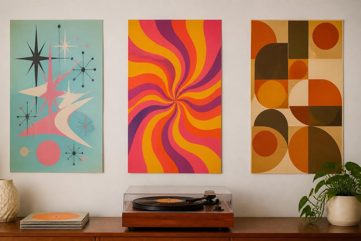
Retro print art employs color with intentional boldness rarely seen in contemporary minimalist design. The retro design trends from different decades reveal distinct color philosophies that define each era's aesthetic identity.
Understanding these historical color approaches enables authentic retro print art creation:
- 1950s palettes - Pastels paired with black, turquoise with coral, mint with pink
- 1960s combinations - Orange with purple, yellow with pink, contrasting primaries
- 1970s earth tones - Browns, oranges, greens in muted, natural variations
- Cross-era approaches - Unexpected combinations that transcend single-decade definitions
Printing Techniques and Textural Effects
The physical processes that created original retro prints contribute significantly to their aesthetic appeal. Screen printing's inherent imperfections, offset lithography's subtle registration shifts, and letterpress's dimensional impressions all add character that purely digital reproductions sometimes lack.
Modern retro print art often incorporates simulated vintage effects:
| Technique | Visual Effect | Authenticity Level |
|---|---|---|
| Halftone simulation | Dot-pattern texture | High when properly scaled |
| Paper texture overlays | Aged, tactile appearance | Medium, can appear artificial |
| Registration offset | Slight color misalignment | High for period accuracy |
| Ink variation | Uneven color density | Medium, requires subtlety |
| Edge wear effects | Distressed borders | Low if overused |
Cultural and Historical Context
The Social Movements Behind the Aesthetics
Retro print art reflects the cultural optimism, social changes, and technological advances of its originating eras. The 1950s atomic-age graphics embodied post-war prosperity and space-age aspirations. The 1960s psychedelic movement challenged conservative visual norms alongside broader cultural revolutions. The 1970s earth-tone aesthetics paralleled environmental awareness and back-to-nature movements.
Understanding this context enriches appreciation for retro print art beyond pure aesthetics. These designs documented social history through commercial art, advertising, and public communication. College football and university-themed retro prints capture not just athletic history but broader educational and cultural evolution.
Revival Cycles and Contemporary Relevance
Design trends follow predictable revival cycles, with styles returning to popularity approximately 20-30 years after their original prominence. The current enthusiasm for retro print art reflects both this cyclical pattern and genuine appreciation for handcrafted, intentional design that contrasts with algorithm-driven digital aesthetics.
Current revival drivers include:
- Reaction against minimalist digital design saturation
- Appreciation for tangible, textured visual experiences
- Nostalgia for pre-digital communication aesthetics
- Environmental consciousness favoring timeless over trendy
- Cross-generational appeal bridging age demographics
Practical Considerations for Display and Preservation
Framing and Presentation Options
Proper framing elevates retro print art from decorative poster to curated artwork. Frame selection significantly impacts overall aesthetic, either enhancing vintage authenticity or creating deliberate contemporary contrast.
Framing approaches for retro prints:
- Period-appropriate wooden frames in natural or stained finishes
- Thin black metal frames for minimalist modern contrast
- Wide mat borders creating gallery-quality presentation
- Float mounting emphasizing the print as art object
- Clipframe simplicity for casual, changeable displays
Lighting and Environmental Factors
Preserving retro print art requires attention to environmental conditions. Direct sunlight fades inks over time, while excessive humidity damages paper substrates. LED lighting provides safe illumination that enhances colors without generating damaging heat or UV radiation.
Preservation best practices:
- Position prints away from direct sunlight exposure
- Maintain consistent humidity levels between 40-50%
- Use UV-protective glazing for valuable or sentimental pieces
- Rotate displayed prints periodically to prevent uneven fading
- Store unframed prints flat in acid-free archival boxes
Retro print art offers timeless visual appeal that transcends temporary trends, bringing warmth, personality, and historical depth to contemporary interiors. The intentional design choices, bold color palettes, and authentic aesthetic of vintage-inspired artwork create spaces that feel both nostalgic and refreshingly original. Whether you're drawn to classic travel posters, vintage sports memorabilia, or mid-century modern graphics, Favourite Place Prints provides sustainable, high-quality retro print art that celebrates your favorite places and passions while delivering the sophisticated design your space deserves.